Ink
Digital Camera
Scanner
Photoshop
Tablet
Thursday 28 March 2013
Final Project - Form & Function and Information Graphics
The form of the poster is that it's going to be A3 or A4. The function of the poster is to have information for the gig, like the headlining band, the support bands, date, venue and ticket price.
What are Infographics?
Infographics are visual representations of data and knowledge aimed to show information quickly and as simple as possible. They can be used for anything but are mostly used for things like maps, architecture, statistics.
Monday 25 March 2013
Photography - Beate Gutschow Inspired


Beate Gutschow is a German contemporary artist who is known for her landscape photography. Her work is known to be spaceous and include buildings, as well as be done in black & white. Her work looks really depressing because theres no people or natural objects around just dull buildings and space, it reminds me of a dystopia, the sort of place A Clockwork Orange would be set.
The plan for this is to take photos inspired by Beate Gutschow, where we have to take photos in depressing places. Equipment includes a Nikon DX, where I'll take the pics in black & white.
For this we had to take pics of depressing places in the style of Beate Gutschow in black & white, we were only limited to taking pics around college, so finding depressing places would be a bit of a challenge (whereas a block of flats would be ideal for this).
Nikon DX
Mode: P
ISO: 400
Aperture & Shutter: Default
Wednesday 13 March 2013
Final Project - Christie Goodwin


"If music is the soundtrack of your life then it is certain that at some point you have come across a picture of mine". Christie Goodwin has been photographing since 1976. She originally started in fashion photography but moved on to music photography. Christie mainly does official tour and album photography. Her work has been exhibited and she has also won awards.
My opinion of her work is that it's great because it's vibrant and full of energy, also I like the fact that she takes B&W as well as colour shots. Her work is good because she captures the atmosphere of the moment and it makes you feel like you're there. To achieve these shots she uses a Canon with available light.
Final Project - Todd Owyoung


Todd Owyoung is a freelance photographer who does live music photography, tour photography and band portraits. His work has appeared in Rolling Stone, the New York Times, Entertainment Weekly and more.
My opinion of his work is that it's impressive because his pictures look exciting. It's good because his pics capture atmosphere, like for example the musicians rockin' out and the crowd enjoying themselves. Also another reason why his work is good is because the subject is shown as important and there's not usually much else in the pics besides some stage lights sometimes. He does his work with a Nikon and prefers to use available light to capture the look better.
Final Project - Nick Pickles


Nick Pickles is a freelance photographer to take photos of gigs and festivals. His clients include BBC, EMI, Red Bull and Disney. His big break came when BBC commissioned him to do T in the Park which was his start to covering most of the big festivals in the UK.
My opinion of his work is that it's great because it's vibrant and energetic. His work is good because he captures atmosphere, and makes the subject look important. Another reason why his work is good is because his portfolio includes some fantastic photos of performers on stage, for example a shot of the band from the side or behind, with a shot of the crowd and lights in the distance making them look incredible. To achieve these shots, he uses a camera, probably Nikon or Canon.
Monday 11 March 2013
Web Design Project - Reflections

water
E block is reflected in the water in the fountain

puddle
Trees reflecting in the puddle

metal
The fence and opposite building reflecting in the wing mirror

mirror
The door reflecting in the mirror

glass
Studio equipment reflecting in the computer screen
Nikon DX
ISO: 800
The plan for this was to get photos with reflections in them. We got a list of things to take pictures of with reflection including water, metal, glass etc.
We took photos with reflections in them. I think they turned out well because I got good feedback. I was impressed with the puddle one because the tree reflection was done well in it but the double yellow lines ruined it slightly. My favourite one was the metal one, because the photo was taken thrtough a fence and it looked bendy in the reflection of the wing mirror, which gave it a surreal look.
Thursday 7 March 2013
Final Project - Hidden Moves

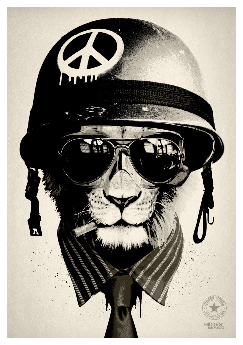

Hidden Moves is the alias of artist and designer Rhys Owen.
My opinion of his work is that I like it because it's got a grungy feel, and it looks cool and urban and also like it because it's humourous with the animal heads. He uses muted tones and a lot of black & white. His work is good because it's modern and edgy. His work is created a mixture of traditional & digital techniques.
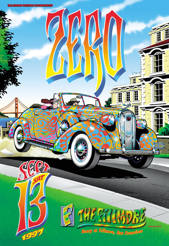
Final Project - Jermaine Rogers


Jermaine Rogers is an artist and designer, and makes modern rock poster art. Since 1995 he has designed for Radiohead, Tool, Deftones, David Bowie, Morrissey, The Cure, Mars Volta, Public Enemy, Them Crooked Vultures, Ween and hundreds of others.
My opinion of his work is that it's impressive because I really like the style of drawing. It's good because the artwork is very detailed, sometimes the drawings look realistic with the shading done well and other things have use of block colour. Another reason why his work is good is because of the use of eye-catching typography. His technique is illustration.
Final Project - James Rheem Davis


James Rheem Davis is a designer who has created a variety of band and film posters. Major influences include Salvador Dali, Andy Warhol, Giger, Frank Kozik.
My opinion of his work is that it's good because his posters are jam-packed with typography and pictures. It's good for the same reasons. His work is done by a combination of computer techniques, he does everything in Photoshop, and theres photo manipulation with some drawing by hand in Photoshop, texts and fonts.
Final Project - EMEK


EMEK is a graphic designer who has been around since the early 90's and is known for his rock posters.
My opinion of his work is that it's great because it's trippy, psychadelic and unusual. It's good because it's very dynamic and also the posters make the show exciting enough to check out. His work is done handdrawn then silkscreened.
Final Project - Frank Kozik


Frank Kozik is a graphic design artist who has worked with Red Hot Chili Peppers, Beastie Boys, Nirvana, The Offspring.
My opinion of his work is that it is very creative because it's vibrant, funny and it kind of reminds me of pop-art. His work is good because the style of artwork is fun, and each poster is something that looks completely unexpected. He does his work by illustrating.
Final Project - Republic City Studio


My opinion of his work is that it's good because of the colour, typography and pictures used. His work is good because each piece is something completely different and the posters of gigs that he has made are interesting enough to where people might check them out. His work is likely done on either Photoshop or Illustrator.
Final Project - Moodboard

Inspirations for my poster design.
The Good, The Bad and The Ugly
The Good


These are good because the style of artwork, colour, typography. Techniques are illustration and Photoshop I imagine.
The Bad
I think this is too bright and there's too many colours to concentrate on
The Ugly

Kind of an eyeache too look at
Monday 4 March 2013
Photography - Still Life

white reflection

black reflection

black background
what we did
set colour balance - incandescent
f16 - small aperture for big DOF
The plan for this was to get still life pics of a glass with different reflections. This was determined by having white and black backgrounds, obviously the white background would have reflect white in the glass and vice versa. Equipment will include a Nikon DX, tripod, glasses, black and white card and studio lights.
We had to have different reflections from a glass. The picture of the glass with white reflection is my favourite and came out best in my opinion.
Subscribe to:
Posts (Atom)