Wednesday 25 September 2019
Tuesday 1 January 2019
Drawings - MORE IN MY FOLDER
click 'drawings' label

This is a cubism piece for the Chi Fest project. I used paint for this. I think getting the shapes right were done well, I like how I made the shades extra big and the guy's hat. I think what could be improved is the colour, I think at the time we were told that cubism usually has 2-3 colours but adding green, yelloew, purple and getting rid of grey would have been better.

For this I had to draw a picture of a building but make the angles look funny, This was a german expressionism piece. I used pastels for this. I think the drawing in general went well. I could improve by using better colours together (not having light blue with bright yellow & orange) and doing either lots of detail or none at all.

For this I had to draw a monster for the ident project. I used ink for this. I think the proportion and detail went well. I could improve by making the dragon look more ferocious and by doing a more exciting pose, like flying and breathing fire for example.

I used Photoshop for this. I think everything went well from colour, to how I positioned everything, the effects. I don't think I need to improve for this, especially since it was displayed at Saatchi.

Materials I used were paint. I was proud of it because I got good feedback, including being told that it looks like a real photo. I think i did a good job at this, I think the different tones, shading, details are what makes this brilliant. I wouldn't need to improve this.

This is a collage. I think I did well by making sure all the pieces got room to stand out. I don't think I need to improve for this.

I did this on Photoshop. I think the idea in general went well. I think I could have improved by making more lampposts come out the sides so they look like crosses, it would have looked mad but it may be impossible.

Another Photoshop piece, I think it went well by making it have a trippy look. I could improve by choosing a better colour than red, at the time I thought they contrasted best but now I think something like green would look better.

This was another Photoshop piece for Chelsea. I think this went well by having the Chelsea text in the background, as well as the photos which I edited. I could have improved by having a couple of more things to cover up the slanted road. This was also displayed at Saatchi.

Materials used were pencil and pastels. I think the style came out well.

I included this because it is a type of drawing... light drawing. The photos came out well but with more practice and good ideas that pop up I could make some of the best light drawings ever.

This is one of many rejected posters for the Chi Fest project but I thought it was good enough so I'm glad I can include it here. I think the drawing went well, also I liked the 'transparent' look. I think I could have improved by using better font.

A screenshot of the last frame of my BBC ident. I made this by photographing the robot suit doing different positions then going into Photoshop and adding pictures of space, with a planet for it to be on. I used Movie Maker to animate it.

A poster design for my final project. More designs HERE.


For this we had to design fonts that had to be inspired by genres, the first one is a techno font so I made it blocky. The second one is art nouveau because of the squirly handwriting.

Pictures of our visit to Saatchi. More gallery pics HERE

This is everything from the Chi Festr project, the final poster, the final logo etc. I did all of this on Photoshop. It finally went well after a lot of criticism. I like how I conquered the 'classical' look, after I originally wanted to make the designs look fun.


Thursday 20 June 2013

Thursday 6 June 2013
Final Project - Exhibition Pics


My pieces for the exhibition. The one of the poster is the best so I displayed that at the top, I also put up my two Saatchi pieces as well as an artist statement.
Thursday 23 May 2013
Final Project - Lens Based Image Making
1. Sports photography
Sports photography is achieved with a DSLR with high shutter speeds. Lenses are needed to go in closer or away to keep up fast enough with the sport going on.
2. Still Life
Still Life is where you photograph an object(s), 'depicting inanimate object matter'. Objects photographed are usually wine glasses, food, flowers and so on.
3. Landscape Photography
Landscape photography is pictures of various places around the world. Landscape photography mostly captures the feel and atmosphere. Places photographed include mountains, waterfalls, beaches, fields etc, all of which have no people included as the aim of landscape photography is to show off the natural environment.

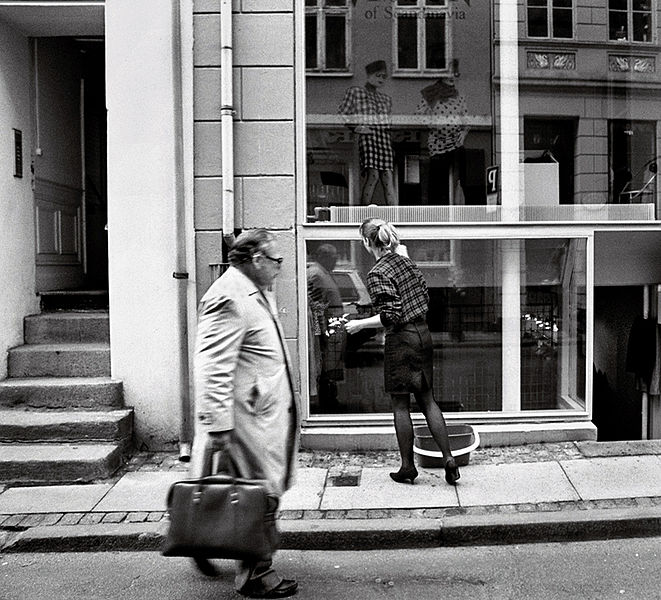
4. Reportage/Journalistic
This is where the reporter is the photographer. They take pictures as things happen, like people standing around, walking by etc.
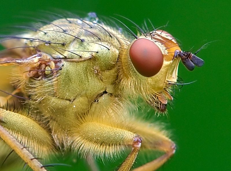
5. Macro
Macro photography is extreme close-up photography in which the size of the subject is bigger than life size. Macro enables small things like insects, snowflakes and other tiny objects. It is done by 35mm equivalent magnification.
6. Portraiture/Figurative
Portrait photography is obviously a photo of a portrait of a subject. The focus of the photo is often the persons face but can include some of their body as well as show the background.

7. Advertising/Commercial - fashion
Advertising/commercial is to sell something. They sometimes do it by using a model to show off the clothes or product.

8. Fine-art
Fine-art photography is getting a shot of a subject with good lighting and the best environment, apparently it 'depicts high quality and beauty'.
Sports photography is achieved with a DSLR with high shutter speeds. Lenses are needed to go in closer or away to keep up fast enough with the sport going on.
2. Still Life
Still Life is where you photograph an object(s), 'depicting inanimate object matter'. Objects photographed are usually wine glasses, food, flowers and so on.
3. Landscape Photography
Landscape photography is pictures of various places around the world. Landscape photography mostly captures the feel and atmosphere. Places photographed include mountains, waterfalls, beaches, fields etc, all of which have no people included as the aim of landscape photography is to show off the natural environment.
4. Reportage/Journalistic
This is where the reporter is the photographer. They take pictures as things happen, like people standing around, walking by etc.
5. Macro
Macro photography is extreme close-up photography in which the size of the subject is bigger than life size. Macro enables small things like insects, snowflakes and other tiny objects. It is done by 35mm equivalent magnification.
6. Portraiture/Figurative
Portrait photography is obviously a photo of a portrait of a subject. The focus of the photo is often the persons face but can include some of their body as well as show the background.
7. Advertising/Commercial - fashion
Advertising/commercial is to sell something. They sometimes do it by using a model to show off the clothes or product.
8. Fine-art
Fine-art photography is getting a shot of a subject with good lighting and the best environment, apparently it 'depicts high quality and beauty'.
Final Project - Designs So Far


This was created on Photoshop with my tablet. I got the idea for this by wanting a grungy, sketchy design for one of my posters. After feedback, I got told to add a logo and change the colour of the fire and this was the result.

For this I had to do a far east market design so I did Japan. I like how I made the colour scheme red since it fits Japan very well. I also think the font with the sun behind was good. I got good feedback for the background going well with the poster. This may be my final design as I think it's the best one I made.


For this design, I got inspired by Matt Needle. I like how it has a kind of 'cyberpunk' look which I realised after making it. I wasn't sure about the font for the name of the band so I eventually changed it to the other logo.

For this design, I was looking through old pics I could use and found this, then after I simply did a hue/saturation to get the colour and then found a good enough font for the logo.

For this I was experimenting with all sorts of effects on Photoshop because I wanted to make something vibrant and mad, and eventually I made something which resembled an explosion (or paint splatter according to others but eithers good).


For this I got inspiration from a poster where it was one colour with plenty of pictures, typography, effects, etc used in the background. The first one I had the main subject completely green but after feedback, I was told it was be better if I changed it to white with an outline to contrast with the green.


For this poster, I wanted to create something completely different so I got the idea to make something look tribal. Also, I got an idea to add 'twins' since thats in the band name so I did two of those statues, and along with the font it came out how I wanted it to look for once. I made an alternate version because I was unsure of the colours, I got good feedback anyways.
Wednesday 24 April 2013
Final Project - Business Plan
a) Terms and conditions - As part of terms & conditions I have to get my work copyrighted, and sort out payments (cash or cheque)
b) Prices and Budgeting - I have to give out rates per hour as well as working out the cost of items that i'll use
c) Tax- Banking Consideration - I have to keep track of bills, payments and keeps receipts
c) Tax- Banking Consideration - I have to keep track of bills, payments and keeps receipts
d) Contracts - As part of the contract, I have to get my model to sign a release form to I can use the photos that feature the models
e) Marketing & Promotion – To promote & market i'll have to advertise by creating a website, using social media.
Business Plan
Business
|
How I will I organise this aspect
|
Summery of business aims and assets
|
To exhibit my poster
|
Terms and conditions
Services
|
Copy right – models- sign waiver – names of business
Payment – how the money is paid and in what form and time
Non payment –terms
Health Safety
|
Bank account business
Loans
|
Talk to accountant – bank manager
Finacial Forecast
|
Tax
|
Talk to accountant – bank manager
Keep reciepts/invoices – bills etc
Keep a record of payments and payments – Excel Document
|
Business Insurance
|
compare business insurance quotes and save money
|
Register your Business
|
get domain name
|
Prices and budgeting
|
Hours and costs of items – offers – rates per hour
Editing – formats – outlay
|
Contracts
|
Model release form – graphic design – client contract – time scale - milestones
|
Marketing and promotion
|
social media, website, advertising
|
Subscribe to:
Posts (Atom)