Monday 26 November 2012

Photography Experimentation - Levitation


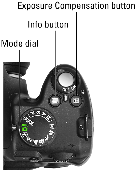
The plan for this is to get pics of levitation. Ideas that me & Harry have are one of a car crash, sitting in mid air and one of my favourites which is where someone will pose like a superhero where it will look like they are flying in the air. Equipment includes Nikon and ladder. Location is in college.
 
We did this by taking a picture of Evan standing on a ladder next to a car, he was leaning towards us with his arms out with an expression on his face as if he's just been in a car crash. After this, we took the exact same pic without Evan or the ladder. Then on Photoshop we put the pic of Evan on the ladder on top of the pic without, then we erased the ladder so it looked like Evan was flying out the car. After this we added effects like broken glass. The other pic of Harry chilling in mid air was done the same way but this time without any effects, obviously.

Chelsea Project - Parts Of A Camera

image0.jpg
                                     image2.jpg

Photographers 2 & 3

Hugo Schmolz


I found Hugo Schmolz's work on theredlist. I like it because it has the lighting, shadows, AND the subject. I like pictures which look like they have a lot going on (big rooms, lots of tables, chairs, props, people, lights etc) or ones which are simple... but effective. The staircase is probably my favourite piece of his so far because the concept of taking the pic at the top of the stairs to create the swirl image is great.

Lucien Herve


I also found Lucien on theredlist. I like this work because I like how some of his photos of architecture are taken from a different angle, usually for pictures with shapes. I also like how it kind of looks gritty and urban. Although it's not an architecture piece, the picture of the shadow on the stairs reminds me of Nosferatu everytime I see it.

Wednesday 21 November 2012

Artist Research - Claude Heath

Claude Heath is an artist who does blind drawings who has an unusual way of working, he traces with one hand and draws with the other whilst blindfolded. He has had many exhibitions including one at The Saatchi Gallery.
slideshow image
slideshow image

Artist Research - Ronald Searle

Ronald Searle was a British artist. He is best remembered for his creation of St. Trinians school and for working with Geoffrey Willans on the Molesworth series and is also known as a war artist.


Thursday 15 November 2012

Favourite Photographer - Sebastien Opitz

Sebastien Opitz is a photographer originally from Germany but now lives in Dubai. He takes pictures of cityscapes, nature and people. My favourite pieces of his work are of the cityscapes and light paintings. The cityscapes are good because of the neon effect and how it contrasts with the night sky, it reminds me of 'Tron' because it looks futuristic. Another reason why I like his work is because he has lots of interesting photos, like I wouldn't have picked someone who has just 1 or 2 amazing pics, and also buildings are probably the least boring thing I have ever searched for when it came to people's photography, I think what's in the photo is what makes it brilliant, not just lighting, shadows etc. I like his light paintings because they look like they could be used for better things, and they are inspirational in a very odd kind of way. I have to say his cityscape pictures make want to live there.


Monday 12 November 2012

Chelsea Project - Tinting & Enhancements

Retro Tint

It's a simple technique but I'm pleased with it. Basically, to start with I had to get a photo and click on 'Gaussian Blur' and set the radius to 3.5 then change my blending mode to Overlay to give it a softer look. After this I made a new layer and click on 'fill' then pick a colour, I picked bright green because I imagined the outcome would be better off green, although bluey purple would have been my second choice, after this I changed the blending option to 'pin light' then set the opacity just right and I ended up with this, I MIGHT make it a bit less green next time but it still looks great.

Black & White?

I'm not sure this turned out as it was supposed to, but it would be a bit harsh to cool this a failure. I followed the tutorial but it turns out the tutorial was done in Paint.NET (I think) instead of Photoshop, but I decided to at least try and make this into something good so I changed the background colour but kept the picture black & white...

Chelsea Project - Moodboard Of History Of King's Road

Beautifully Unhinged Project - Quiz


Beautifully Unhinged Project - Health & Safety

Dark Room Safety

1. Water spill - warn people and clean up
2. Chemical spill - use emergency eye wash
3. Being In The Dark - no running, walk instead
4. Walking With Scissors - hold by blade
5. Electricity & Water - clean hands

Studio Safety

1. Backdrop & Wires - tape them to floor
2. Knocking Over Flash Heads - don't crowd the studio
3. Dropping The Camera - wear strap
4. Food & Drink - eat or drink outside

Thursday 8 November 2012

Beautifully Unhinged Project - Evaluation

For this project, we had to make book covers for Annelies Cornelius. The book is called 'Beautifully Unhinged' and the themes for this included death, same sex relationships, arachnophobia, females, insecurity, mental health etc. I mainly got inspiration just from these keywords but also from Penguin book covers and Far East books and also contoversial book covers. I used techniques like photography and typography and edited on Photoshop. I photographed girls modelling, did blind drawings, contour line drawings, and collages. After making about 20 different designs, I picked my final 4 which can be seen in the link below.

Final 4 Book Designs

Beautifully Unhinged Project - Final 4 Designs


The reason why I picked these 4 is because the pattern and sketch ones got the most positive feedback, whereas the spider and collage ones were because I had a good feeling about them and because I can clearly imagine them as being 'Beautifully Unhinged' (they just look right and perfect for the covers), in fact they are probably 2 of my favourite ones. The rejected 2 were the skull cover and I THINK the hanged one. I was disappointed about these being rejected because I felt like they were great and that they also got positive feedback, the skull one was good because it was a blind drawing and it was close to the real pic but looked cool anyways and apparently looked like 'Picasso' haha, and the hanged one wasn't good because I don't know why, it's controversial, and features about 2 of the themes for Beautifully Unhinged.

Monday 5 November 2012

Chelsea Project - King's Road History

1960’s
Chelsea Drugstore was originally a chemist with a stylised chrome and neon soda fountain upstairs. It was referenced in the song ‘You Can’t Always Get What You Want’ by The Rolling Stones and was also used as a film location in A Clockwork Orange. It later became a pub but is now a McDonald’s.

1970’s
Malcolm McLaren’s boutique Let It Rock was renamed SEX in 1974. It sold punk clothes.

Chelsea Project - 2 Philosophies

Saatchi Philosophies
Brutal Simplicities Of Thought

It's easier to complicate than simplify. Simple ideas enter the brain quicker and stay there longer. Brutal simplicity of thought is therefore a painful necessity.

Lovemarks

 Their own unique way of branding a product that inspires loyalty and praise
By the consumer – they believe it inspires loyalty beyond reason!
Lovemarks thinking is the unique way we look at the relationships people have with products,
services and entities. Lovemarks are the future beyond brands because they inspire Loyalty
Beyond Reason. They’re also capable of generating sustainable growth beyond normal expectations.
We have a highly developed, formal methodology for raising brands to Lovemark status.
At its core are the five key steps which make up the 'Path to Love’.
These are, DISCOVERY, XPLORING, INSPIRATION, ATTRACTION and EVALUATION.

The ‘Path to Love’ is driven by insight and by the emotionally engaging ideas we generate for our clients at the INSPIRATION step.

Chelsea Project - Proposal & Timeline


PROPOSAL

Aim of the Project
To complicate or to simplify - ??????/
To learn about the world of exhibiting art, graphics, photography and design
For you to create a graphic design piece or photographic series that has meaning
or message related to Chelsea – you have to show how you
were inspired in your creative thinking to come up with your idea and concept to promote an aspect of lifestyle In Chelsea
You will follow the design cycle when creating your work but you must decide on
        the creative direction
        overall intention and message – either stemming from social/political/psychological
perspective
        You will keep a diary and reflective log on your Blog which will be submitted with your
Final piece (s)
You must write an artists statement that will go next to your work
You must work as a team to produce a brochure/poster and flyer
We have two galleries to display the work
You must also select 2 pieces of work from your body of work over the last year that you would like to offer the curator to choose from
The curator has the final say of what goes up

TIMELINE

Week 1

Moodboard related to History of King's Road
Colour tints in Photoshop
Artist Research

Week 2

Research & Photoshop skills

Week 3

Chelsea visit and lots of exciting pics

Week 4

More research

Week 5

THE FINAL WEEK