Thursday 31 January 2013

Web Design Project - Umbrellas

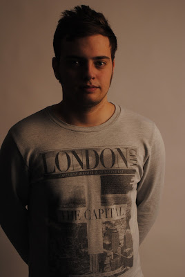
white umbrella

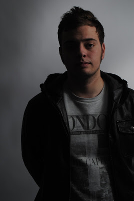
gold umbrella

silver umbrella

studio set up
 
The plan is to have someone stand near an umbrella to have light reflect on them for the photo. Equipment includes Nikon and umbrellas. Location is in the photography studio.
 
For this we had to take a picture of someone standing near an umbrella to get the light to reflect on them for the photo. The white umbrella had soft light and the silver umbrella had hard light, the gold one simply came out with a glow effect.
 
Nikon DX
ISO: 400
Mode: Program

Monday 28 January 2013

Web Design Project - Web Terminologies

ABBREVIATIONS & WEB TERMS

Uniform Resource Locator (URL) - link of the website

Voiceover Internet Protocol  (VOIP) - something to talk with, e.g. Skype

Hypertext Mark-up Language (HTML) - code that enables your site to the browser

Cookies - data stored in the users browser that notifies the site when the user next goes on the site and follows their activity (clicking on things, logging in, records of pages viewed)

Javascript, Perl, ASP, Java - plugins on the site that allow more functionality

File Transfer Protocol (FTP) - transfer files

Cascading Style Sheets (CSS) - describes the look of the site

Animation protocols for web e.g. Flash (FLV, SWF)- more interactivity on the site, used for videos, animation and games

World Wide Web Consortium (W3C) - The main international standards organisation for the World Wide Web

Web Content Accessibility Guidelines (WCAG) - A series of web accessibility guidelines pubilshed by the W3C's Web Accessibility Initiative

TYPES OF WEBSITE

Fixed - site that stays the same size

Fluid - increase/decrease elements on a larger screen

Elastic - sizing/elements on page based on typography (increase font size, site gets bigger)

Monday 21 January 2013

Web Design Project - Height, Angle & Crop


camera height - looking up or down

I got good feedback for these because of the perspective, big at the top and small at the bottom or small at the bottom and big at the top.


camera angle - by rotating the camera

I got good feedback for these also because of the strange composition, with the funny angle in the way the fifth pic is taken and with the almost perfect 45 degree angle in the sixth pic.


cropping - no post-production

The ninth pic is my favourite because it's like a DOF pic.
 
The plan is to get pics of different heights, angles & crops. Equipment includes just a Nikon as this is outdoors. Location is in town and around Chi.
 
For this I had to get pics of height, angle & crop. It came out well because I got good feedback for my height & angle pics because of the good composition and perspectives. I think I did well with the crop pics too. My favourite is the last pic because it's amazing.

Web Design Project - 3 Branding Artists

Ashfall Design
Neal Mullen is a designer who does web design, illustration and branding. My opinion of his work is that it’s good because he’s very talented and knows a lot about web design, which he mostly taught himself. His illustration is sometimes quirky but always bold. My favourite piece of his is ‘Dark Of The Moon’ which was for a contest to try and come up with Linkin Park’s next CD cover, I like it because it looks professional and has good fonts and colour and I think he did a brilliant job.
Spoongraphics
Chris Spooner is a graphic designer. I think his illustration is good because the designs look great, even though they are kind of funny and bizarre. My favourite pieces of his are ‘Chemical Imbalance’ because it looks like a galactic poster, and my other favourite is ‘Retro’ because I thought it was a clever looking idea which would also be good for a logo, CD, poster, T-shirt, etc.
Rob Clarke
Rob Clarke is a typographer and designer. He designs plenty of logos and custom fonts for clients and collaboration with designing and advertising agencies. His clients include Cartoon Network, Dulux, Russian Standard Vodka, Rowntrees, Currys, Monopoly, Tetley, Hovis and way, way more.

Web Design Project - Compare and Contrast The Services of Wix & Moonfruit

Wix
Services offered – to create a website
Available space – 500MB for free, 500MB-2.5GB depending what the user pays for
Features of a free website –  no set-up fee, templates, Google analytics, premium support, ‘fully customisable’.
Features and cost of a charged website with the provider – The price varies depending on what the user signs up for. For example for unlimited bandwidth it’s £9.31 a month.
Moonfruit
Services offered – to create a website
Available space – 20MB for free, 1GB-10GB storage space limit depending what the user pays for
Features of a free website – 20MB, 1 website, 15 pages, shop.
Features and cost of a charged website with the provider – The price varies depending on what the user signs up for. For example for a standard account it’s £7.20 a month. Other features for a charged website includes way more storage, multiple websites, mobile optimized, online shop, blog.

Wednesday 9 January 2013

Saatchi Gallery Visit


My opinion of this is that it's exciting but I don't like how it's ripped off Silver Surfer by using it and just changing the head. The work is good because it attracts the viewer straight away by its use of mad colours, comic style drawing and strange sculptures of heads. It's made by printing out the illustrations on the boards, and the sculptures are of mannequin heads and wooden blocks.

This piece is good because it's surreal and has faded colour with shadow which makes it look kind of creepy in a fascinating way and that is exactly why I like it. I would imagine it was made on Photoshop rather than being illustrated.

                                    
I like this because it's very cartoon like, surprisingly I think that the scruffy, jaggedy drawings of shapes contrast well with the cartoon, as well as the cartoon being black & white and the shapes in colour, I think it would have been a mistake to have both in colour. It's good because it's quirky, humourous and the cartoon may remind people of their childhood. It was made by being illustrated with paint and ink.

I like this because of the colours and shapes again, it may resemble a paint splatter just made with the triangles. It's good because it's simple yet effective and visually pleasing. This was made on Photoshop most likely.

Chelsea Project - Evaluation

The aim of this project was to take photos in Chelsea and edit them for them to be shown at the exhibition at Saatchi Gallery. I started by researching King's Road by doing a moodboard and writing about the history of King's Road. After this I researched PLENTY of artists and photographers to get inspiration from. Soon after, the group and I had to go to Chelsea twice to get photos of King's Road, I made sure to get pictures of architecture and the World's End shop to edit nicely later. Eventually I had to create 4 pieces, 2 of which got put up at Saatchi :) .