Monday 25 February 2013
Web Design Project - Evaluation
For this I had to create 2 websites, one for myself and one for a client. I started by researching types of websites (formal, blog, artistic, photographic) and decided that my design for both sites should be photographic so I get the chance to show off really good photos as they would take up the whole page on the home page and contact page for example. After this we had to research web terminologies to learn about web terms & abbreviations. For my personal site, I aimed for it to be simple but interesting and got the chance to show off my graphic design and photography work as they fill the home page and contact page. It looks good because it's easy to navigate, has the best of the best of my work and does what it says on the tin. To improve it I wouldn't use Wix because it's rubbish and each template takes away creativity, there's no room for logos, and you can't change the layout or font. For my client site, I aimed for it to look professional for a site about flowers and I think I did a great job. Originally, I wanted to do a band but I wasn't sure that they were reliable enough for photoshoots and I got access to the other client because they needed a site. To improve it I would do the same thing for the other site.
Web Design Project - Working With The Client
Client - Town Flowers
CONTACT DETAILS ON WIX SITE
Meeting 1
We discussed dates I would take photos and did research by looking at website designs to decide on which template fits the layout best. We also discussed the new logo design.
Meeting 2
I took the photos then showed the logo design
CONTACT DETAILS ON WIX SITE
Meeting 1
We discussed dates I would take photos and did research by looking at website designs to decide on which template fits the layout best. We also discussed the new logo design.
Meeting 2
I took the photos then showed the logo design
Web Design Project - Website Design Issues
Problems I can have with designing a website is sizing for example, because nowadays people access sites on their phones and iPads so the website may not look right with a small screen, a solution to this would be to create a mobile version of the site somehow. Another issue would be that the client changes their mind halfway through the project, my group has experienced this plenty of times, a solution to it would be to have weekly meetings about the site, showing them progress, etc.
Web Design Project - Print Screens Of My Sites

My site. I decided to use a simple design to make it easy to navigate. The fonts, colours and layout can't be changed unfortunately since I'm using a Wix template, so I decided to make everything suit the template, for example use my collage for the black & white main pic.
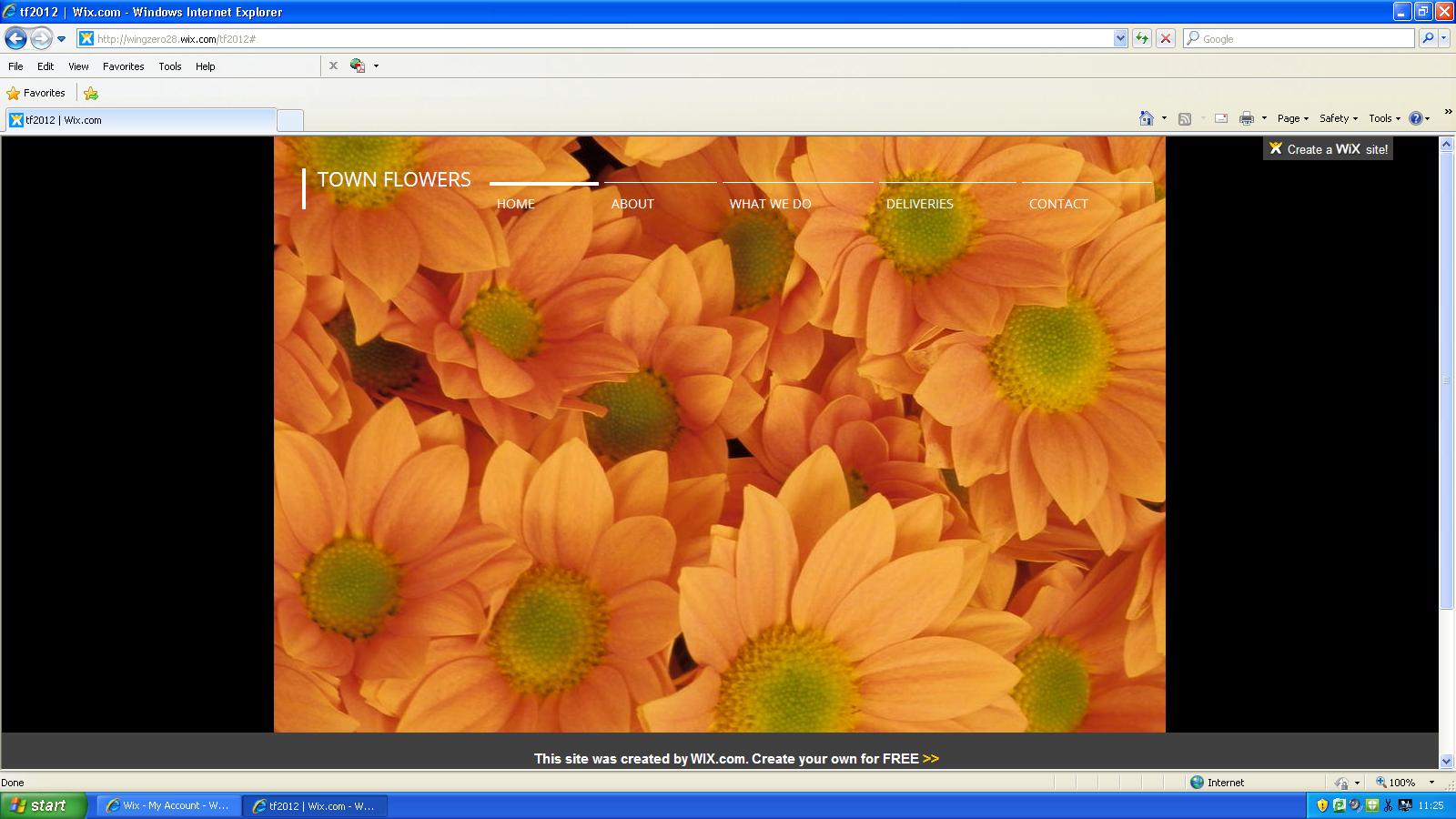
My site for the client. Originally I wanted to do a site for a band but I wasn't sure that they were reliable enough for photoshoots so I got access to another client who needed a site. I did research about flower sites to make this look as professional and realistic as possible, once again I chose an appropriate template.
Web Design Project - Proposal & Timeline
Proposal
For this project, I have to create a website for a client and for myself. I have six weeks to do it. The websites have to be done on Wix. The site about myself is to show people in the future my work, it has a collection of the best photos and graphic design pieces I have done. For the site being made for the client, I'll have to have meetings with them about how they want their site to look. Before all this though we have to learn about web terminologies and research different types of websites.
Timeline
Week 1: Research
Week 2: Designing a logo & icons
Week 3: Taking photos
Week 4: Meeting with client
Week 5 & 6: Making The Site
Final Project - Proposal & Timeline
Proposal
For this project I have to independently design for a chosen client. The project has to be something like what I want to do in the future, so I decided to do a poster for a gig. I'll have to get research for this by looking up graphic artists and photographers who work in the genre.
Timeline
Week 1 - Research
Week 2 - Written work
Week 3 - Start designing
Week 4 - Posters
Wednesday 13 February 2013

Web Design Project - Facebook & Twitter Icons


For this I had to redesign the icons for Facebook and Twitter. I am proud of my FB one because its in keeping with the company website. I'm not a huge fan of the Twitter icon, I didn't really know what to do for it as I wanted to do something totally different so I thought about what was popular/relevant to Twitter and came up with the idea of using the hashtag, but coming up with the colour and style of the symbol was tricky, I experimented with the formula many times and this was the best I could come up with.
Rejected icon

Web Design Project - Reflectors

black

normal

silver

white
The plan for this is to get pics of our subject with different light on them based on the reflector. My equipment will include a Nikon DX with no tripod needed, the umbrellas, studio lights and a hotshoe. The location will be in the photography studio.
This was just like the umbrella task but with reflectors, the results were closely the same: hard light with black but this time soft light with silver. For some reason, the picture of the gold reflector did not want to come out properly for me or my group, the picture just came out dark.
Nikon DX
ISO: 400
Program: Mode
Monday 4 February 2013
Web Design Project - Background, Foreground, Midground

One of my best pics because of the angle and positions are good (building right in the middle, small room on left, cars on right)

I like this because it reminds me of a professional photo

This one came out well because I had the start of the wooden railings in the foreground and the rest of it in the mid-ground (as well as the trees in the background)
All 3

Simple background shot of white painted brick wall

Probably the least interesting photo of a background pic of mud

Another background pic of floor, looks kind of interesting in a way because of the weird pattern
Background

Good pic because the bricks take up all the room and it shows texture

Foreground pic of door with Fire Exir sticker on

Another great professional looking picture I was impressed with
Foreground

I did this pic because of the car being in the mid-ground

Mid-ground pic of railings and things that have been dumped

Not a very interesting pic but I tried
Mid-ground

I saw the bikes as a good photo op

FG & BG pic of a No Cycling sign in front with trees in the back

FG & BG pic of wooden railing in front with the rest in the back
Foreground & Background
The plan for this was to get 3 pics of each. Since I have to take these pics in college, I try and get the most interesting angles, objects etc possible. My equipment will only include a Nikon since this is outdoors. Location is in college.
For this we had to take pics of things in the background, foreground, mid-ground, foreground & background and all 3 of them. My favourites are the foreground & background ones because they are more visually interesting
Nikon DX
ISO 400
Web Design Project - 3D

Close up of pic of fountain. I got recommended to take this pic and I'm glad I did because I think this may be the best one i did.

Another good one, I thought this looked colourful

This looks okay but I think you can only tell it's 3D because of the window at the top
The plan for this is to get pics in 3D. I'll do this by taking a pic then moving my camera carefully 7-8cm to the right then following a tutorial about changing it to 3D in Photoshop. My equipment will include a Nikon and ruler. Location is in college.
I did this by taking a photo and then moving the camera 7-8cm to the right. Then in Photoshop I opened both photos one on top of the other, then I went on channels (in Layers) and unchecked Red so it would appear blue-green (cyan) then I lined them up to make a 3D image and checked it looked cool with 3D glasses.
Nikon DX
ISO: 400
Mode: Program
Web Design Project - Layout & Design
Characteristics & Design Layout
http://www.jessicafortner.com/

http://www.ruudvaneijk.com/

Both logos are in the top left of the page
Both sites have icons for links to the Facebook, Twitter, Tumblr etc. pages in the top right corner
Both sites have toolbars that are featured next to the logos that have near enough the same things (home, about, artwork, contact etc)
Both sites have thumbnails that lead directly to enlarged versions of the artwork that often has some info about the piece with it
Jessica Fortner's home page has mostly pictures of the artwork with barely any writing on the page
Ruud Van Eijk has a huge banner on the home page that has moving pictures because it's a slideshow
Subscribe to:
Posts (Atom)